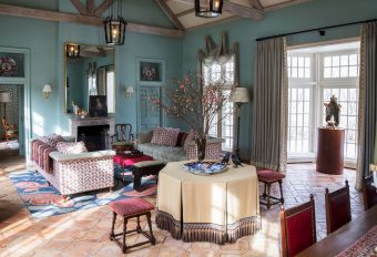
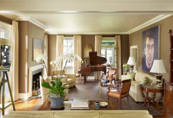
This townhouse was originally built in the 1860s in the early neoclassical style, with many handsome details from that period still present. But it also possesses layers of changes and additions completed by the many generations that have passed through. The 1900s saw the addition of a classic paneled library and incorporation of reclaimed 18th-century Georgian mantels and windows, reflecting the period’s pervasive Colonial Revival taste. The 1930s brought an atrium of coral stone. Later owners loosely divided the building into apartments and offices.
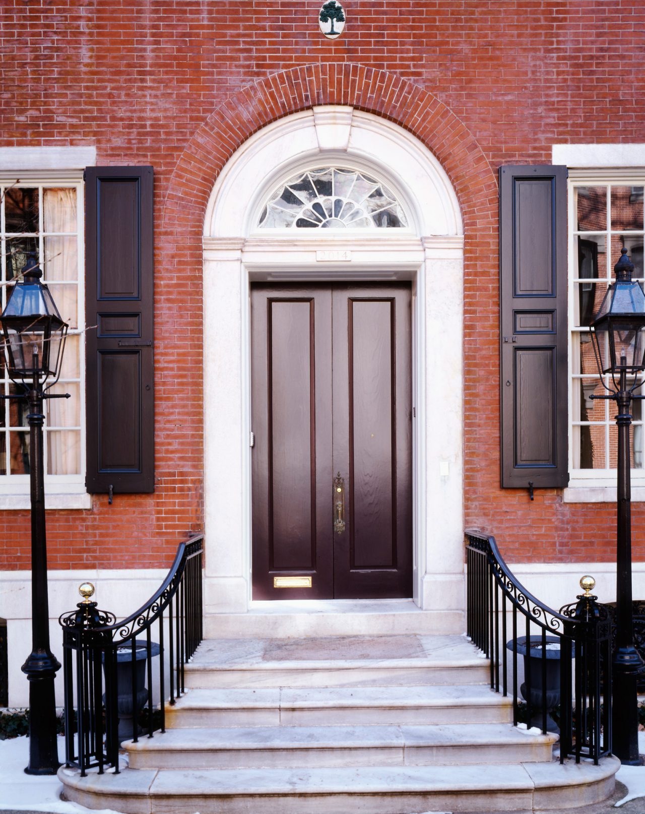
We replaced a pair of low doors between the living and dining rooms with a column screen to take advantage of ceiling height and allow light in from both sides of the house. This also gives more visibility to the handsome set of glazed doors and transoms, originally part of an old shop façade, which was incorporated into the house in the early 20th century. Color also became a unifying element between adjacent areas. We used a rich but soft palette on walls and applied a medium blue color on the connecting hall floors. The rooms now fit more easily together and provide a setting for a collection of art and decorative arts that is as eclectic as their architectural setting.
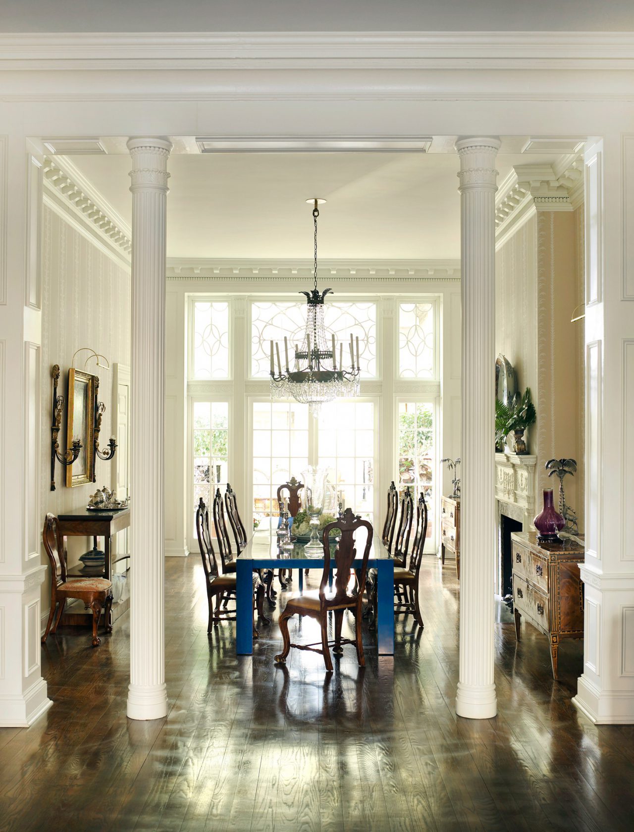
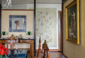
There are three approaches to using antiques in current decoration: to create period rooms that reflect a certain date; to furnish rooms with antiques for the same date but not necessarily intended to all be in the same room; or to create a mix of furniture that is old and new juxtaposed for their shape, color, and patina. The contrast of the newly blue lacquered Parsons dining table from the 1970s surrounded by the Portuguese chairs is a strong example of this third approach. The rich collection of architectural elements in the dining room is unified by the wallpaper, an 18th-century English pattern of alternating stripes. Over the commodes is one of a pair of gouaches by Franz Kaisermann. These capriccios, one depicting the Arch of Titus and the other the Temple of Sibyl at Tivoli, complement the architectural themes of the room.

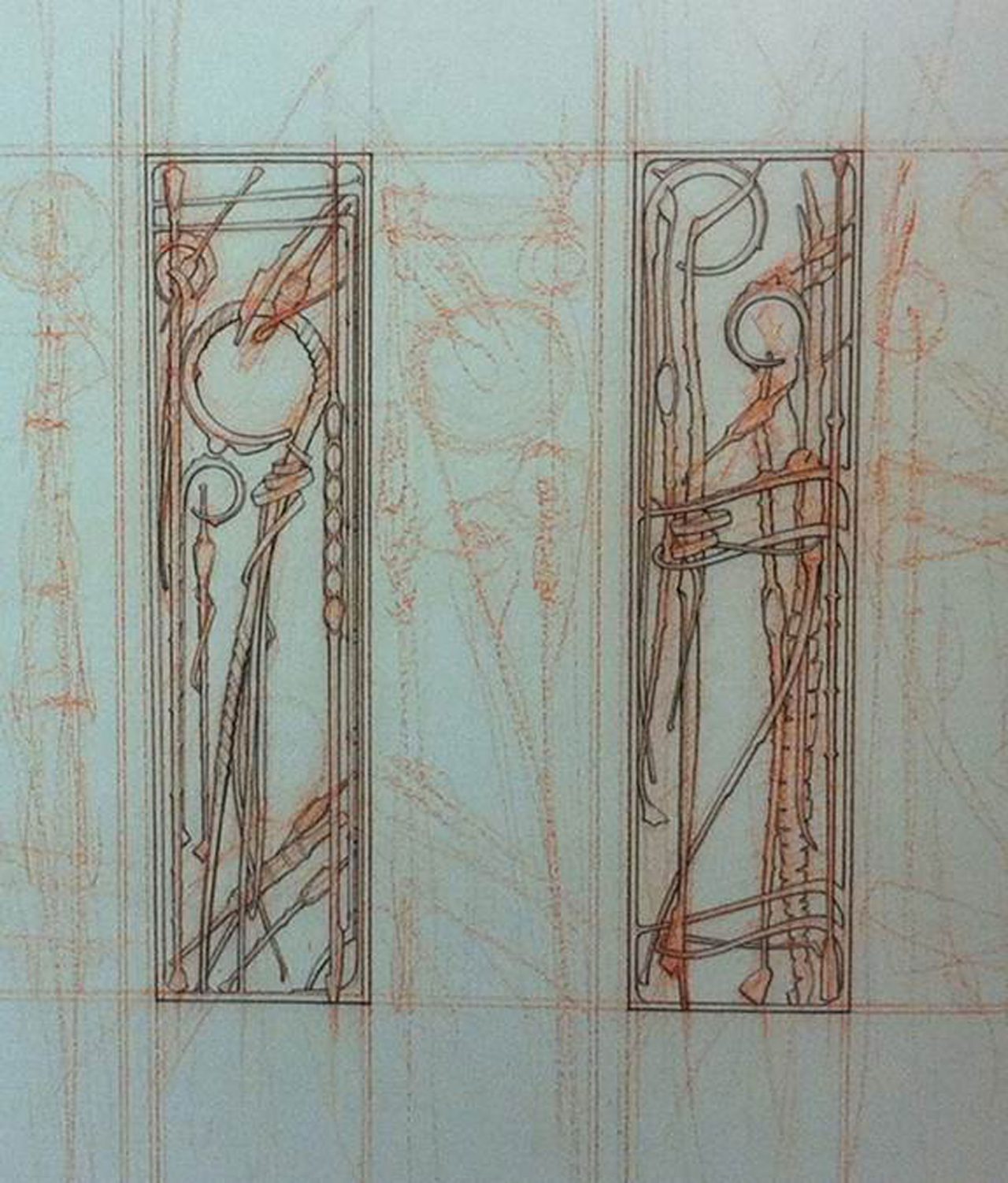
The core of the clients’ wide-ranging furniture collection was actually created for a modern house where their sculptural forms contrasted with the rectilinear architecture. In their new setting, the design of the historic house provides a more complicated background and juxtaposition between the two. The entry hall is emblematic of the new decorative approach. Gates by sculptor Albert Paley, a Swedish neoclassical table, a Danish mirror, and a painted lantern create an intriguing dynamic.

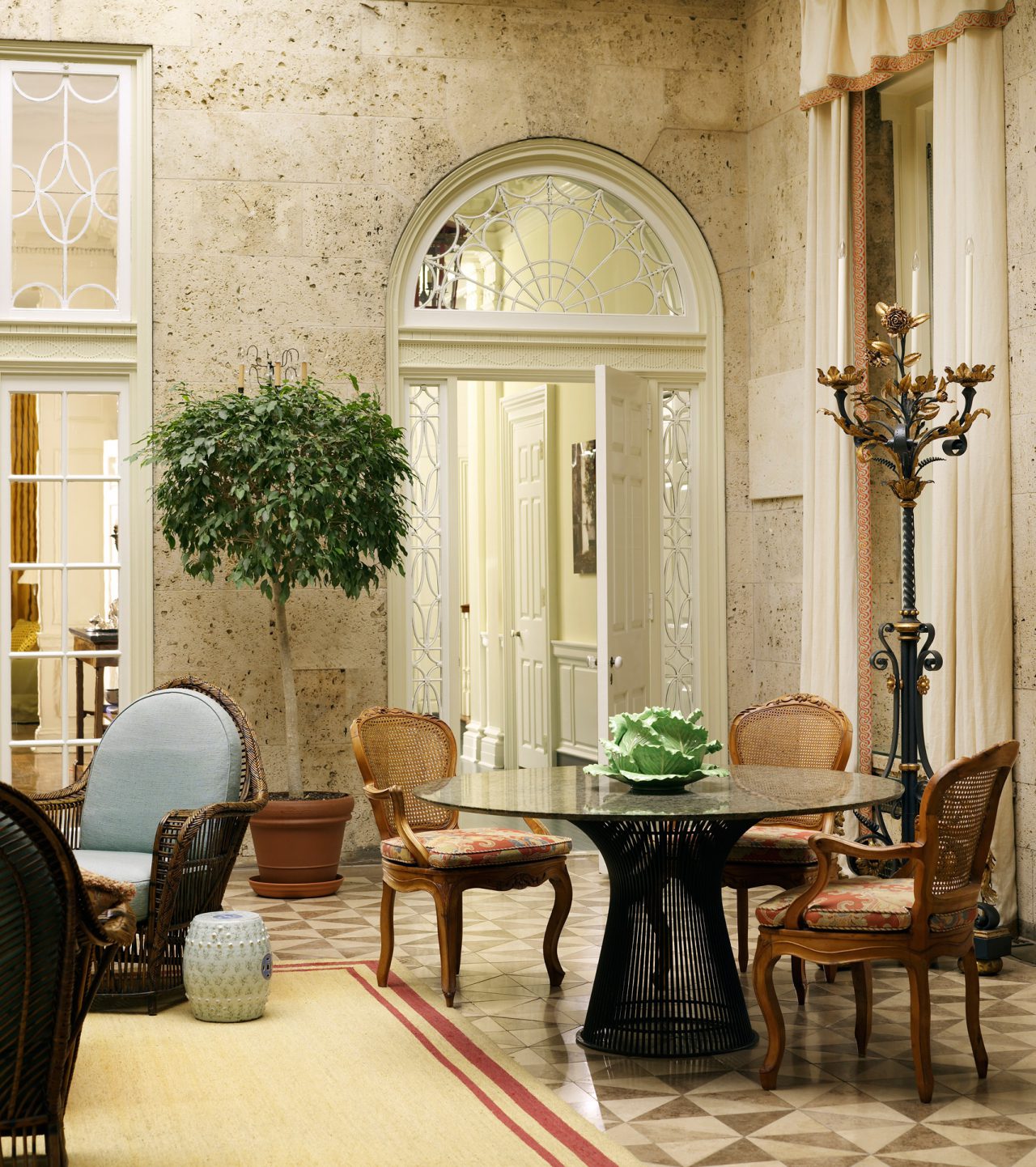
The solarium has walls made of Texas shellstone, and the plaque above the fountain has a local provenance. It was carved by Giuseppe Jardella at the end of the 18th century for a folly on the Morris estate and later used on the façade of Benjamin Latrobe’s Chestnut Street theatre, sadly demolished around the time the solarium was built in 1931.

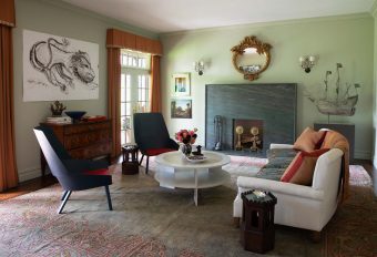
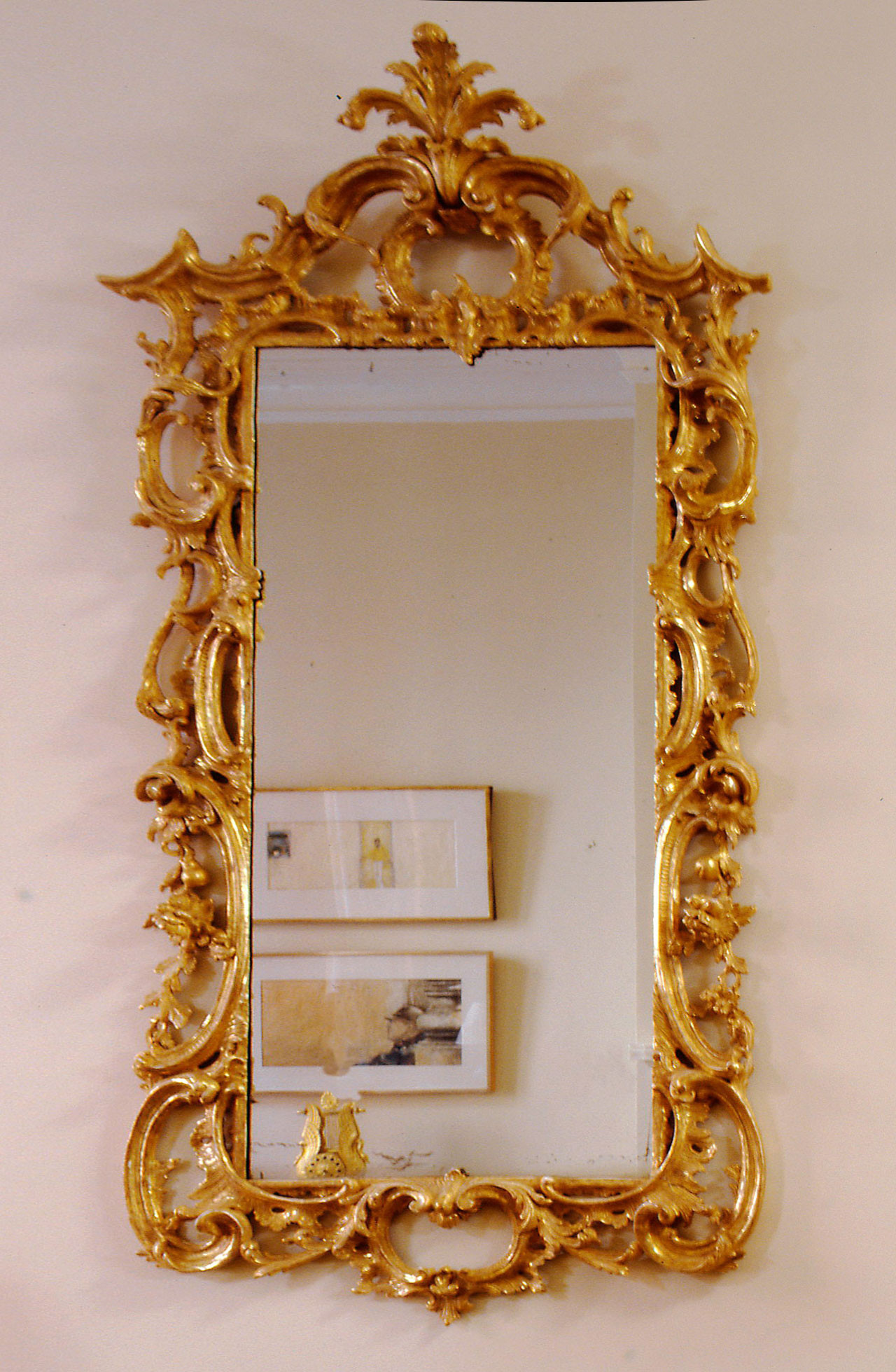
The drawing room features a Chippendale sofa whose curving silhouette contrasts with the more linear contemporary upholstered pieces. The painting above the mantel, The Odalisque, (1845), was painted by Rembrandt Peale. An early-20th-century Spanish carpet has relaxed symmetry that supports the variety and quality of the furniture. Completing the room are a pair of Continental tables with bird-form bases and a large and finely executed English rococo mirror whose scale allows it to command almost an entire wall.

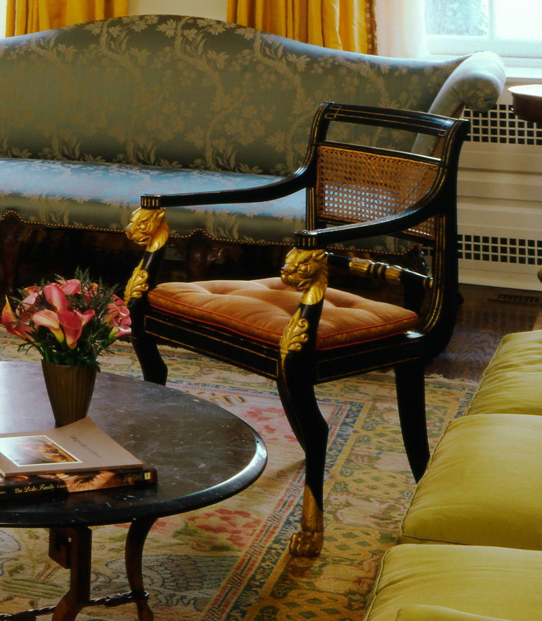
In the library, a Chesterfield sofa and wingback chair sit before an 18th-century English mantel, which was added to the house around 1900.

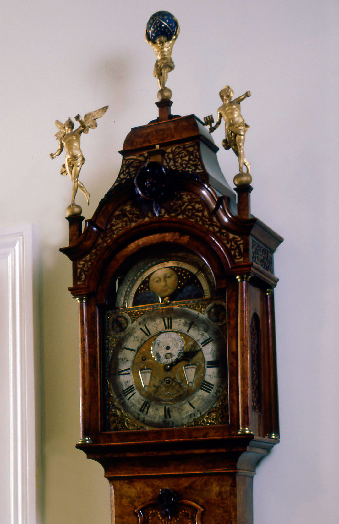
The original pine floors of the central hall were painted an aqueous shade of blue green. The long-case rococo clock is Dutch.

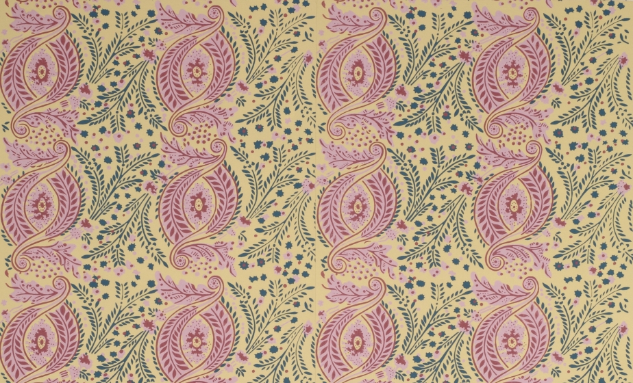
Another guest room is covered in handblocked wallpaper based on an early American pattern, Ada Harris, from Adelphi Paper Hanging. The traditional design feels modern in this context. An original Maurice Sendak drawing with a character out of Where the Wild Things Are sits on the mantel, above contemporary chairs with backs patterned like paper doilies. The room, like the others in the house, is a prime example of “decoration as collage.”

The bedrooms have an equally diverse mix of furniture. In a guest bedroom, a steel canopy bed is juxtaposed with an English Regency girandole mirror, William and Mary chest, and an early neoclassical mantel, installed in the house around 1900, painted dark grey with Dutch tile surround.

A custom-made striped runner rises the full four-story height of the main staircase. The Gothic chairs, originally found in the house, were modernized with a bright red painted finish. The runner is patterned after a 19th-century American example.


